Design Process
Below you’ll find a case study that closely resembles my current design process, you will get a relatively detailed view on how I conduct research, translate findings into takeaways and transform them into guidelines for the design that follows. Similarly, you will see my visual design process, testing and iteration; in the end viewing a complete product that I deem worthy of showcasing.
Edit (2025): Revolut expanded upon their existing bill-splitting options so the design is less relevant now than previously. Still, I see value in showcasing the process!
Adding a New Feature within Revolut
Project Type
Independent
Proof of
Concept
Concept
Role
Research
Product
Design
Design
Testing
Tools
Figma
Google
Forms
Forms
Whimsical
Duration
6 Weeks
2023
Overview
Going out with friends = a fun, stress-relieving activity, right?
Not quite! At some point the check comes and everyone goes mad: people exchanging bills, not having change to tip the waiter — some people don’t even carry cash… how do we solve this?
🚨
The Problem
There’s a reason why splitting the check is a staple of situational comedy — it’s awkward, tedious & more often than not, at least one person leaves unsatisfied with the way things were split.
🧩
The Task
Since Revolut is already the favored service for small cash transfers like drinks or dinner, users would greatly benefit from an integrated “Split the Bill” feature to streamline the process of splitting a check.
PROJECT CONSTRAINTS
🔧
Dev Workload
Utilize underlying processes already existing within Revolut to minimize backend demands.
🎯
Brand Style
The new feature should integrate
seamlessly into the preexisting design system and brand guidelines.
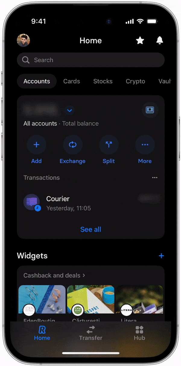
This feature is a perfect blend of user value and developer simplicity.
What got me thrilled about this idea is that Revolut already has the foundation in place — We're just talking about making a few small changes to bring it to life. The solution could be as simple as using basic math with input values specific to one device.
Moreover, it seamlessly integrates with the current interface without causing any disruptions to the existing system — It's like adding a puzzle piece that fits perfectly into the overall picture.
There were two distinct possibilities for the end product
The user interface and backend framework for these two features would have distinct information architectures. Before dedicating my precious time to the design process — I must first decide which of these options to pursue.
👤
Single Person
The entire flow is managed on a single device.
👥
Group Involvement
The flow involves interconnected devices.
Competitive Analysis
Different apps... not really!
Though the four competitor products I explored in detail demonstrated a range of approaches to the problem of splitting the check, all could be broken down into the same 3 stages:
🕹️
Input
Manual entry or OCR (camera) scanning
📌
Assign
Assign items to users or split between users
🤑
Request
Display payment breakdowns (may include Revolut link)
STRENGTHS & SHORTCOMINGS
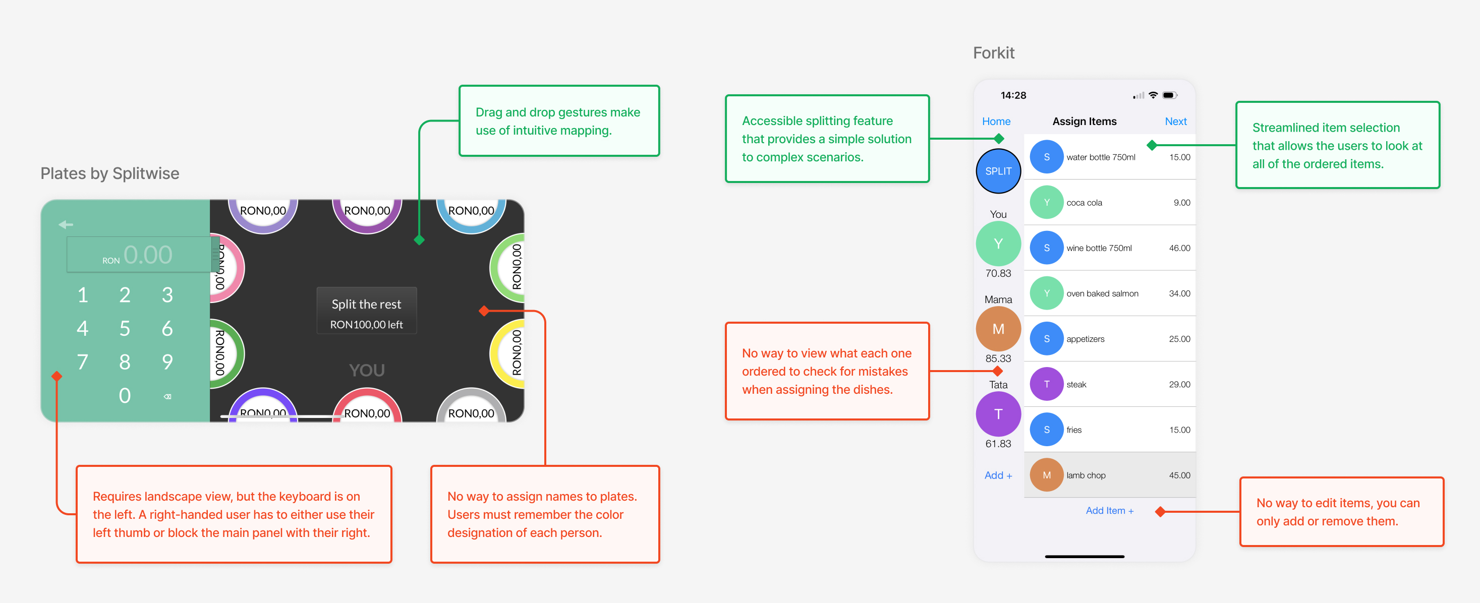
Selected notes on two competitor products
I identified two major pitfalls to avoid: tedious item entry and overwhelming displays of data.
❌
Time-consuming item input
OCR scanning technology proved error-prone and frustrating on receipts, but manual input quickly becomes tedious and repetitive. Input must be as fast and simple as possible.
❌
Information overload
The data needed to carry out the flow builds up fast. For bills with more than a few items, the data begins to look like a wall of indistinguishable text and overwhelms the user.
Using the camera to scan the receipt sounds like an ideal solution but falls short due to its error-prone nature.
While reliable OCR technology would eliminate the issues mentioned above, the current state of the technology makes it more trouble than it's worth — That's why I decided to focus on designing a system that allows for manual input instead.
A feature native to the Revolut app would have a crucial leg up over third-party competitors.
While reliable OCR technology would eliminate the issues mentioned above, the current state of the technology makes it more trouble than it's worth — That's why I decided to focus on designing a system that allows for manual input instead.
✅
Use full names & avatars
Instead of having to remember an arbitrary color or cartoon animal, users can identify their friends directly by their Revolut handle and avatar.
✅
Send all requests at once, right in the app
Since the tool would be integrated into the payment method, the user could save time by requesting all payments with one tap.
The main challenge — striking the perfect balance of complexity.
After conducting thorough research, one thing became evident: the greatest challenge lies in providing users with the necessary control and options to accommodate various use cases, all while avoiding an overwhelming interface.
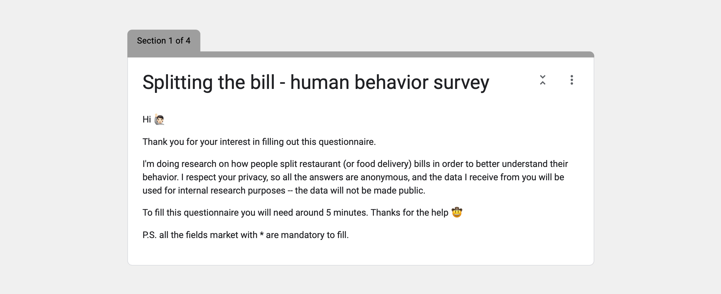
Survey
METHODOLOGY
I knew I wanted to collect some kind of quantitative information
To verify some of the things I had hypothesized, I conducted a user survey that provided answers from 15 people and achieved a (pretty) clear understanding of the main characteristics of the people who encountered problems and would in turn serve as potential users.
FINDINGS
🏦
78% of participants use Revolut
Revolut was their preferred peer-to-peer transactions app.
👶
Most users are <25 years old
Most users are between 18 and 25 years old.
🤔
Users haven’t used such apps
Little to no users had user bill-splitting apps before
Is quantitative data going to cut it? Not really!
I knew quantitative information wasn’t going to cut it, so I added the option for the people who felt extra nice to apply for a round of user interviews — and they did, I got 3 interviewees!
User Interviews
METHODOLOGY
3x 30 minute in-depth conversations
My user interviews took the form of three in-depth conversations with people who fell into Revolut’s target demographic (young adults with some degree of disposable income - usually in university) based loosely around a framework of questions and lasting around 30 minutes.
OBJECTIVES
🔧
Identify common logistical difficulties in splitting the bill.
Understand the various challenges users run into and their corresponding solutions and workarounds.
🔎
Gain insight into the emotional underpinnings of the process.
When money enters close relationships, things can quickly get uncomfortable.
FINDINGS & ANALYSIS
The user interviews were very illuminating, particularly in terms of the subjects’ emotional experiences.
Overwhelmed by my interview notes, I created an affinity map to parse out common emotional threads and logistical insights. The following themes emerged:
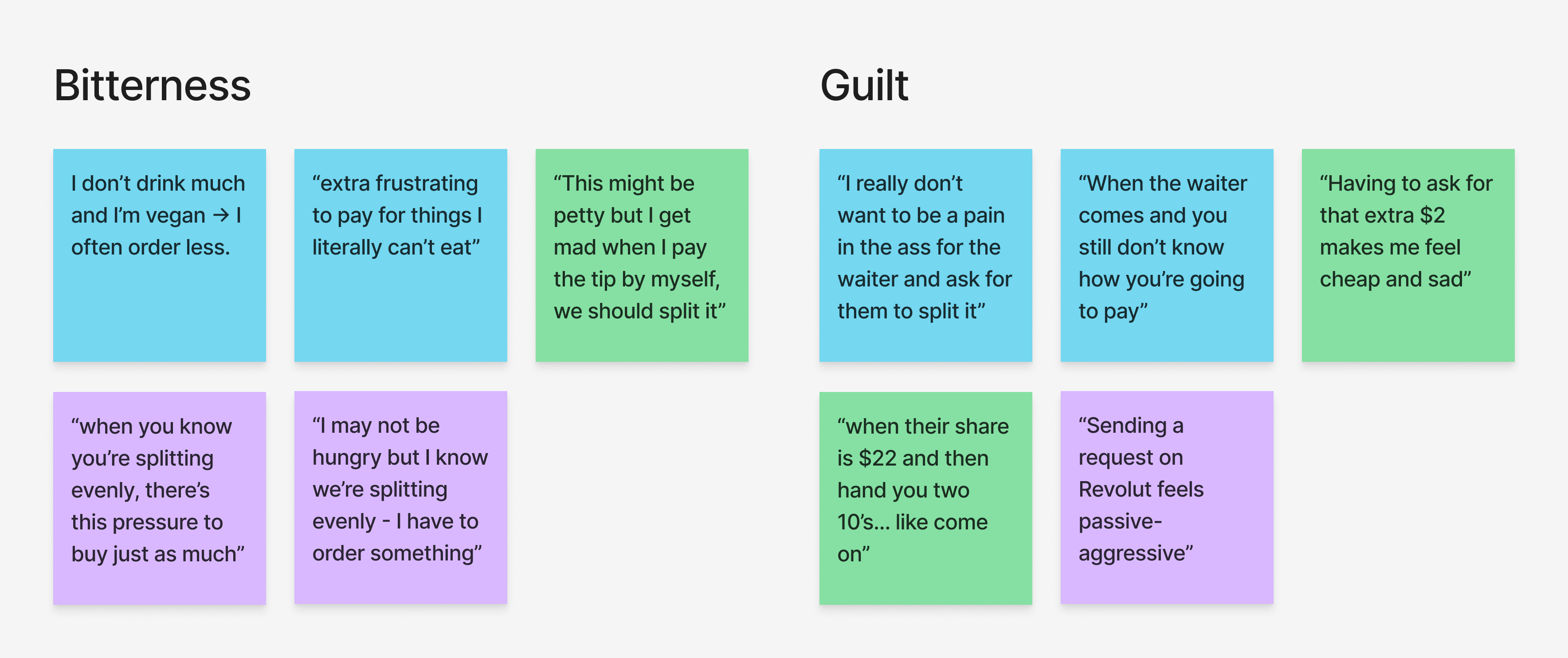
Selected affinity map clusters
SELECTED RESEARCH FINDINGS
DESIGN INSIGHT
🔎
Friends view loans between each other as a symbol of trust.
”It’s kind of a nice thing to have with friendships — that trust that they’re eventually going to pay you back.”
💡
Account for a range of desired precision.
This feature should accommodate this laid-back attitude and support both a relaxed and a strict approach towards splitting the bill.
🔎
People find it uncomfortable to remind someone about a debt they owe.
”When you’re having a good time, it suck to be in a situation where you have to put your fingers in each others’ pockets at the end of the night.”
💡
If the feature doesn’t offer a choice between paying or requesting, this guilt could be absolved.
In other words — it’s the technology, not the user, who makes (or should make) the call.
🔎
The environment is chaotic and not conductive to focused thinking.
”At the end of a night out, basic arithmetic turns into rocket science.”
💡
Minimize the load on the user’s working memory.
Eliminate the need for any mental math — make the splitting as intuitive as possible.
Based on my findings and the reality of dev demands, I decided to go with the single-device option.
Since it uses local variables instead of importing variables across devices from synchronous users, it would be much simpler on the backend.
Single Person
The entire flow is managed on a single device.
Group Involvement
The flow involves multiple interconnected devices.
The sunk cost taken on by the person covering the check means there is a financial incentive to complete the flow.
Even though the single user approach requires more effort from the person leading the process, they are also the one who paid the bill. Therefore, they have a personal investment in ensuring the flow is completed successfully.
Additionally, this solution still allows for group involvement — The user can choose to pass
their device around, enabling each person to control their portion of the split. It adds flexibility and inclusiveness to the process.
Among the three use cases I selected, I found the scope of the project to be the most intricate.
Due to time constraints and the fact that the other two features were already established and well-received in the app — I decided to focus solely on the "food & drink" use case.
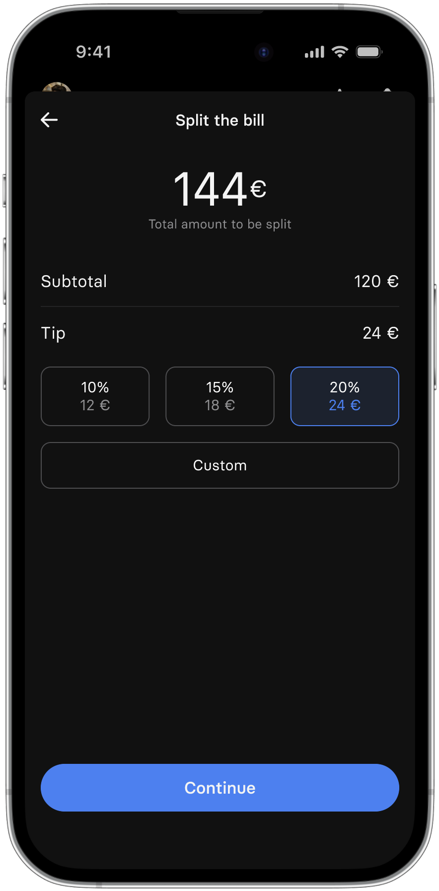
Even Split
A total amount split evenly
This feature is present in
Revolut
Retail
A total amount split unevenly
This feature is present in
Revolut
Food & Drink
A feature that allows the user to split a complex (restaurant) bill.
Ideation & Design
I designed a user flow to tackle a complex scenario. The item input stage posed a major challenge — I aimed to learn from competitors' mistakes to ensure a smooth experience.
How can I organize and make sense of a complex bill with many items?
Using chronological groups — to make it look like a restaurant menu.
This approach would group items in the order they appeared on the table, reflecting the actual dining experience. It would enhance user recollection and help locate items during the assignment process.
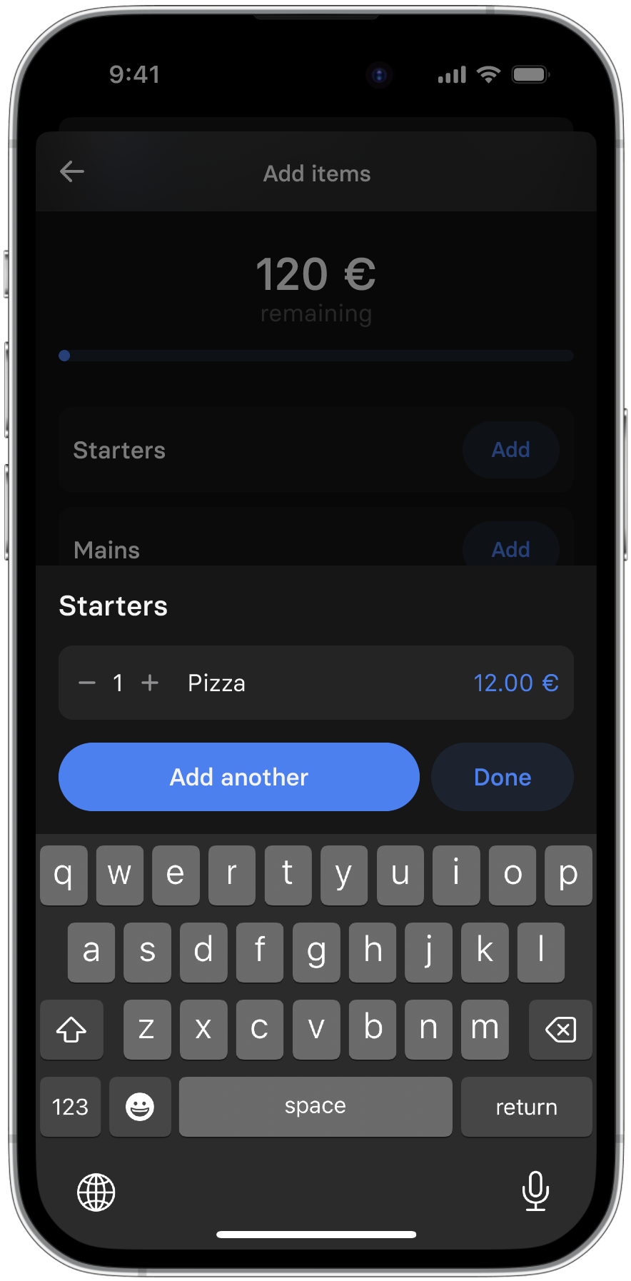
To implement this, users would need to specify the item's type, along with its ID, price, and quantity during input.
How can I streamline and simplify the item input process for maximum speed and ease?
Categorize items for input
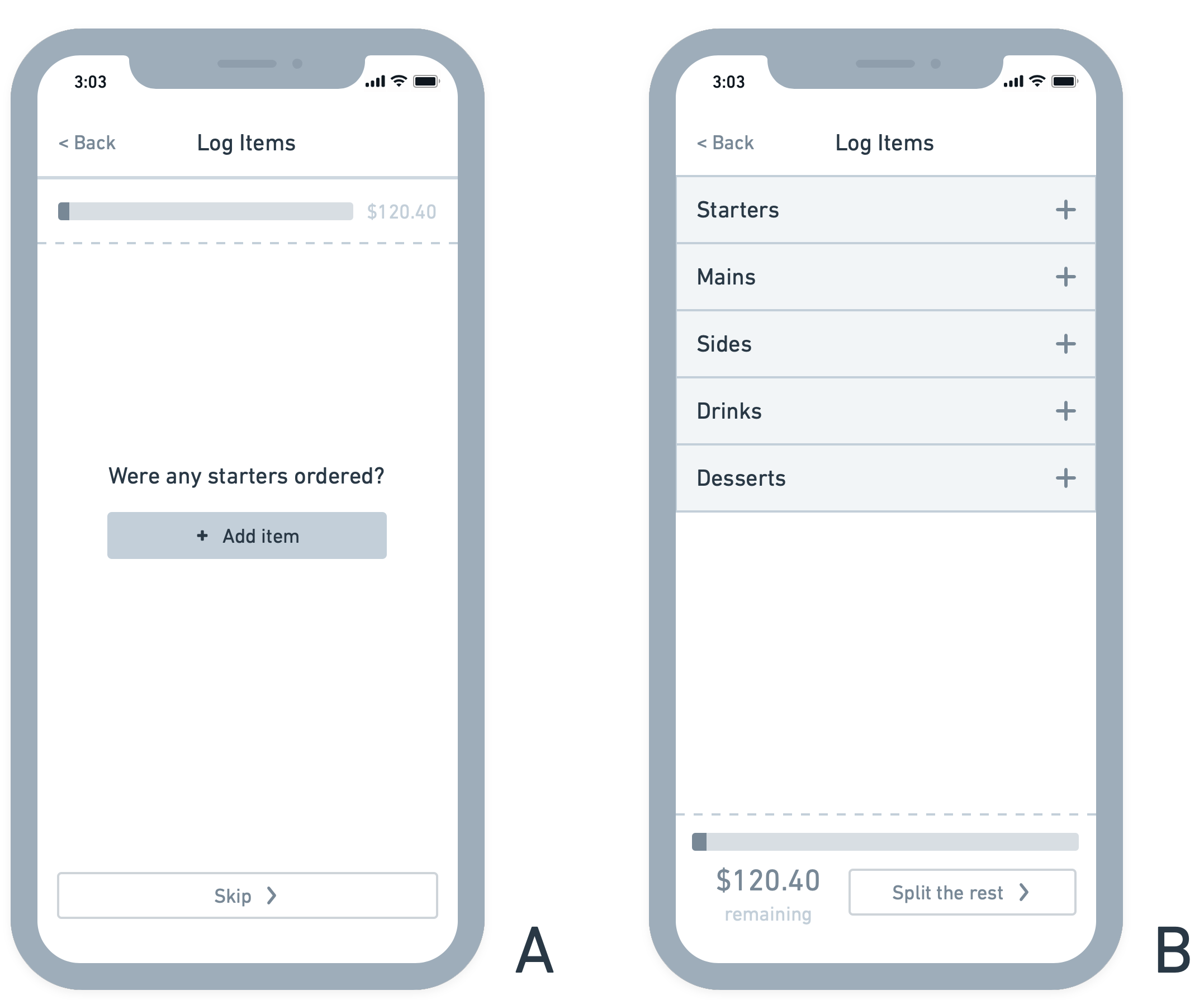
Initially, I considered guiding users through item categories step by step [A]. While it reduced confusion about actions, it became too complex for simple or small meals.
Instead, presenting all options on one screen [B] allows users to select only the relevant categories, eliminating extra steps. This combines adding a new item and categorizing it into one simple action.
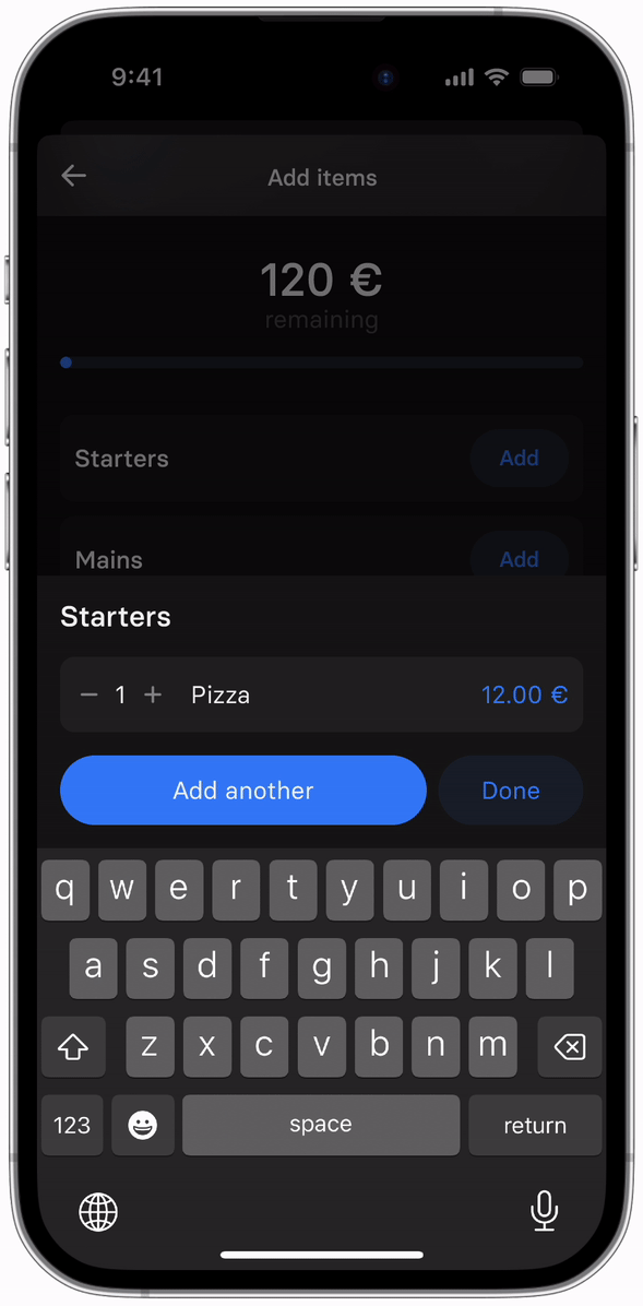
“Add Another” button
To simplify the process of adding multiple items within a category, users can tap the "Add Another" button. This reveals an additional input field for a new item within the same overlay — eliminating the need to close and reopen the overlay for each item.
Progress bar
To enhance clarity and encourage completion, a progress bar based on the remaining unassigned subtotal would be implemented. This visual indicator keeps users motivated and minimizes the likelihood of abandoning the flow.
Despite these modifications, I questioned whether the input process might still require too much effort.
Was the clarity and convenience of the assignment process worth the labor required for input?
Prototyping, Testing & Iterating
Real problems require realistic settings
To ensure the usability of the feature, I conducted usability tests with five participants who were within Revolut's target demographic (which also happened to be my friends). I wanted to replicate the scenario where individuals would actually use this feature — I conducted the tests when we had just finished an evening at a restaurant.
Equipped with a prototype on my phone and a note containing information about the people, their orders/shared items, and the corresponding costs, I closely observed as the participants completed each task.
3 TASKS
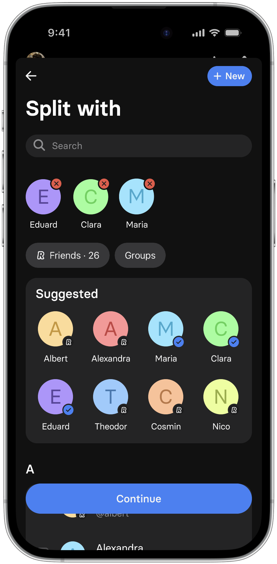
Add the participants
Add the ordered items
Attribute the items
Preliminary usability testing confirmed my suspicion that the flow demanded excessive input labor.
Initially, I had a gut feeling that the process would be labor-intensive, particularly considering the intricate nature of creating the prototype. Covering all possible actions and states would have taken me several days to accomplish.
One participant's feedback resonated with my concerns: "It's like I'm ordering the food again." — This highlighted the need to find a solution that prioritized speed in the input phase (even if it meant compromising some clarity and elegance in the assignment phase).
I returned to the drawing board to devise a simpler input method that reduced the upfront effort required from users.
Despite my efforts to minimize input labor while ensuring all necessary data for the assignment flow — I reached a point where achieving a faster method would necessitate an entirely different input framework.
RETHINKING THE SOLUTION
One of the reasons why Revolut is known for its user-friendly interface — its integrated calculator.
To enhance convenience, a custom keyboard with basic arithmetic operators allows users to split or combine items directly in the price input field.
However, similar to a calculator, this feature can only store one value at a time, resetting as soon as an operation is executed. Unfortunately, this functionality is not suitable for anything more complex than simple calculations. As a result, users would need to start over to verify their work, hoping to obtain the same result.
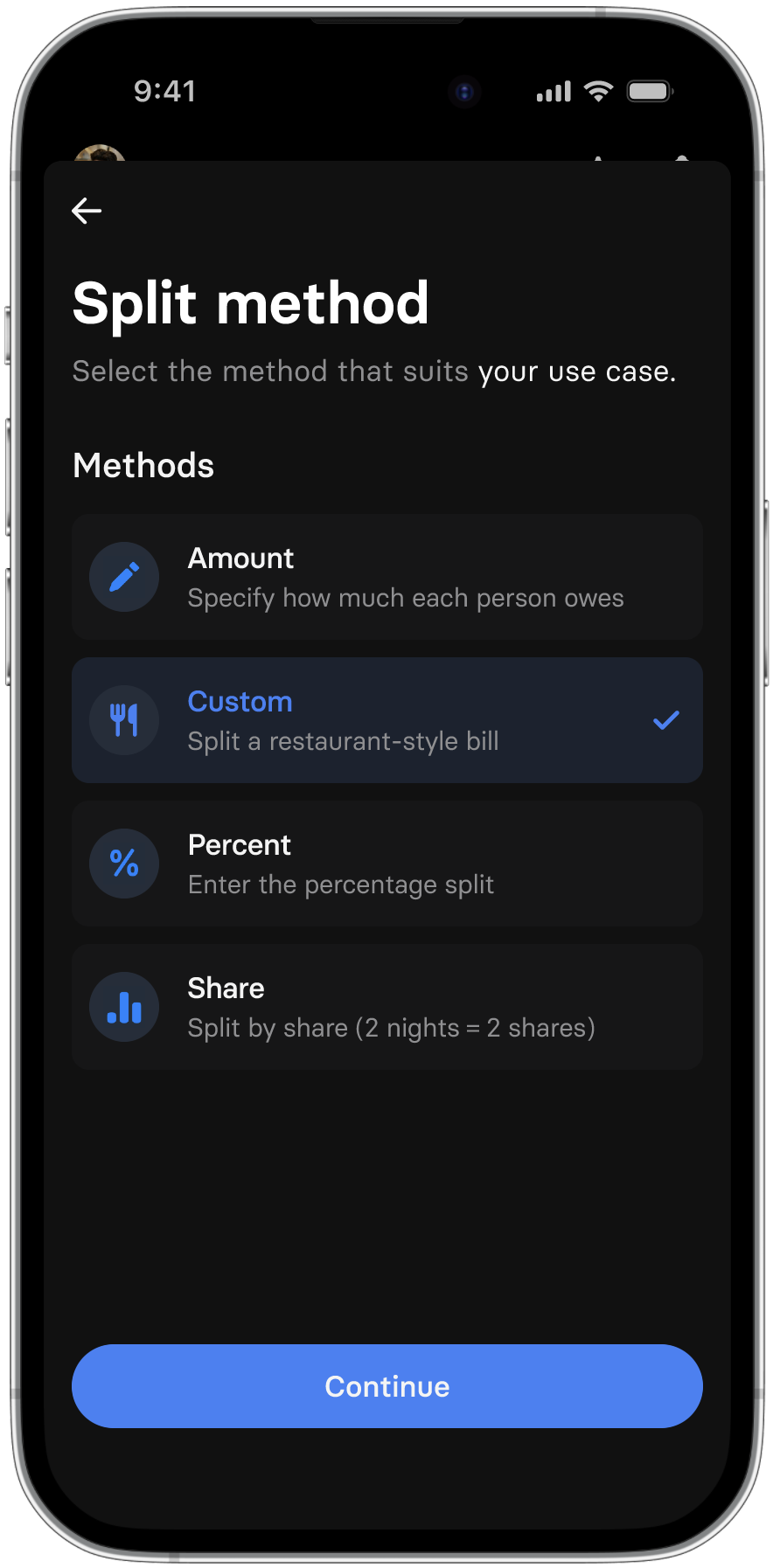
NEW SOLUTION
Allows the user to quickly split an item
Makes use of Revolut’s preexisting built-in operators
Supports longer strings of operations
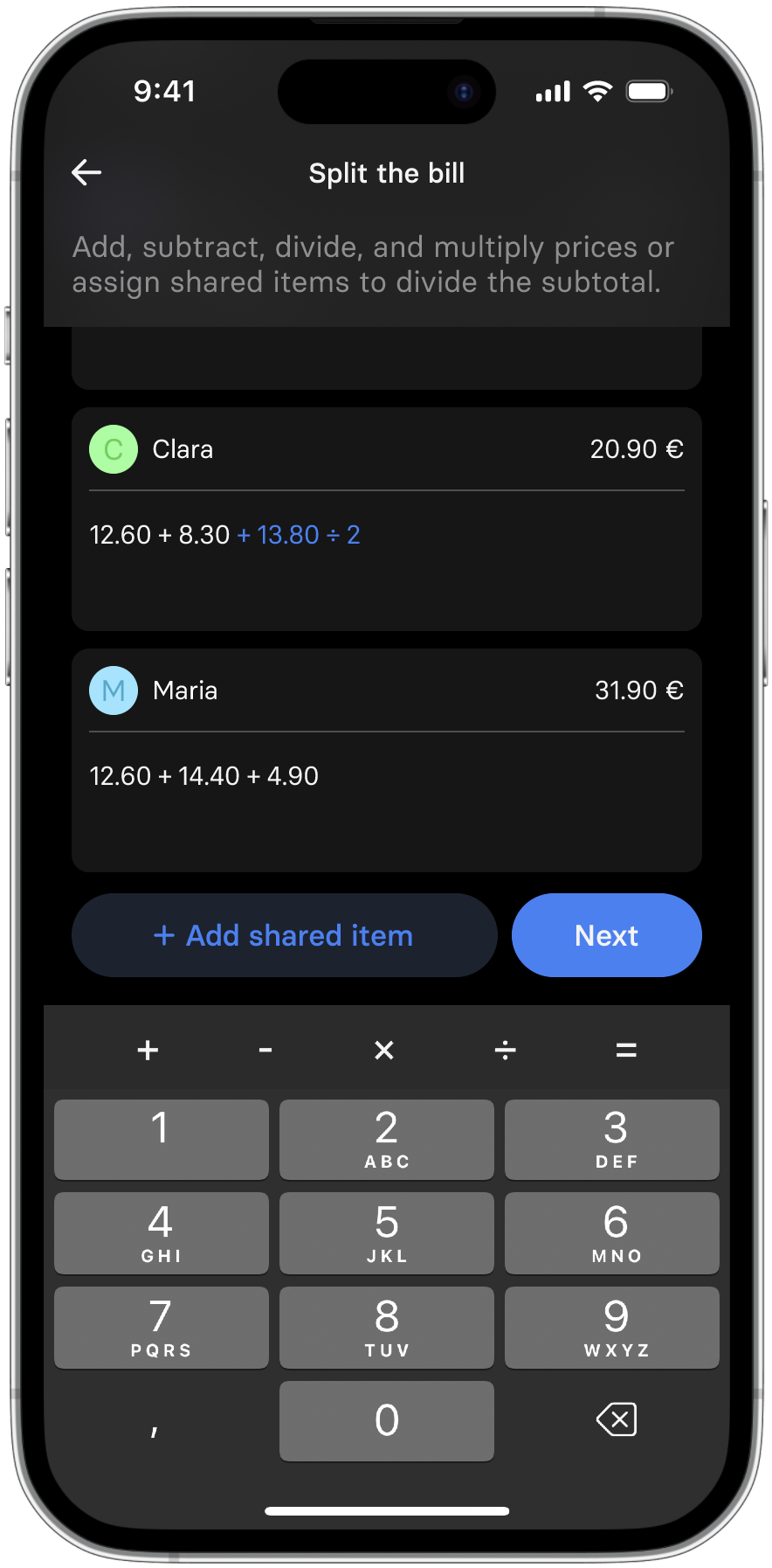
UPDATED DESIGN
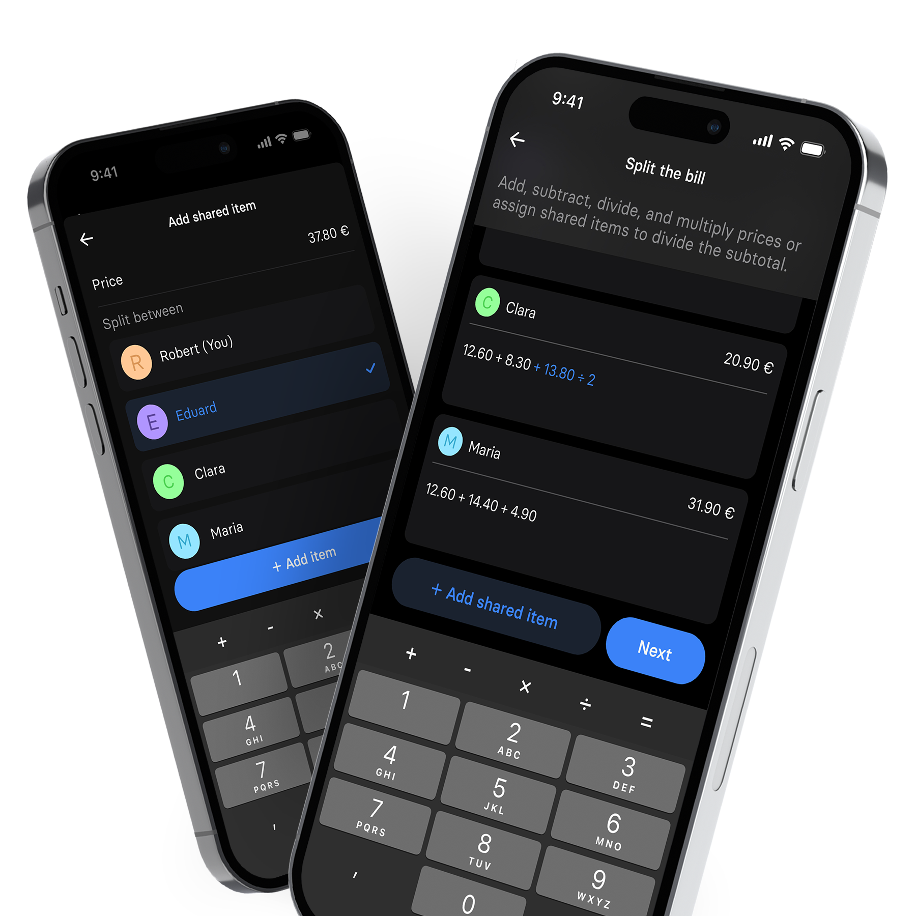
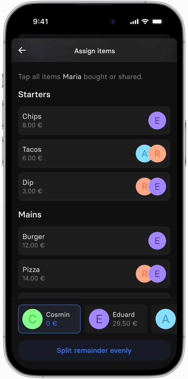
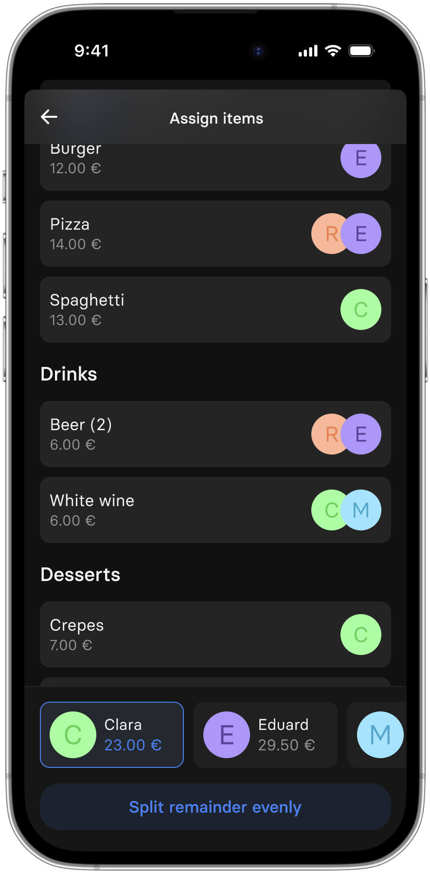
A semi-familiar request overlay.
The visual design resembled the default request flow but accommodated multiple people, ensuring users are familiar with the expected functionalities.
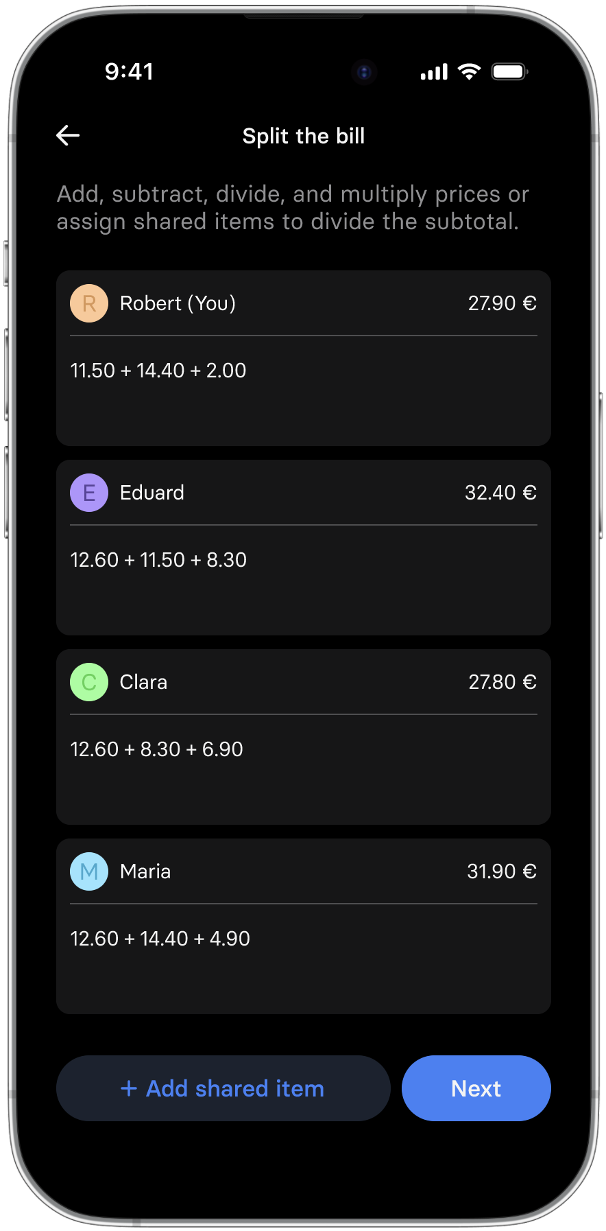
Calculations stay visible in the input field.
Rather than resetting, the calculator's "history" is retained and displayed below the current value in the field. This allows users to view and revise previous operations if needed.
"Add shared item" button facilitates quick splits.
This button enables users to swiftly divide a price among specified individuals.
PROTOTYPING
During the development of the interactive prototype, I encountered the limitations of the available tools.
This project proved to be challenging to prototype and test, for various reasons that I hadn't initially anticipated. I aimed to observe precisely how users would input data into the device, but it was impossible to account for all the possible paths they might take.
Due to the unavailability of a developer or sufficient time to code a prototype myself, it was challenging to incorporate the necessary flexibility crucial for the success of the feature.
Even with more advanced prototyping tools, the limitations persisted. While I could allow participants to use their native keyboards and simulate backend calculations with integer variables — the custom numerical keyboard with arithmetic operators (which was crucial for testing this feature) was not supported.
As a workaround, I relied on participants verbally describing any alternative paths they would take, but this approach proved to be tedious and imperfect.
Results
Overall, participants expressed excitement and enthusiasm about the feature.
“I really wish this actually existed. I’d use this a lot.”
All five usability test participants were able to successfully complete the tasks. However, one participant encountered difficulties due to the limitations of the prototype, as they attempted to perform actions that were outside the intended scope of behavior that I had accounted for.
Two participants expressed confusion during the input process.
“I don’t get why I need to say what kind of item it is.”
However, both participants later acknowledged that they found the assignment flow simple and satisfying. If time had allowed, it would have been beneficial to conduct a follow-up test with the same participants after a short period to determine whether their initial resistance to the input flow persisted or if it was primarily due to a learning curve.
After careful consideration, I chose to proceed with the second, simpler method for the complex (restaurant) use case.
Compared to the item-by-item method, this approach provides users with greater flexibility while requiring significantly less development work. As a result, there is potential to deliver this feature to users at an earlier timeframe.
Designing custom components — the Revolut way!
To ensure a seamless integration of the feature into Revolut, I meticulously examined and recreated the existing elements of Revolut's mobile app user interface — by doing so, I ensured consistency and a cohesive user experience throughout the application.
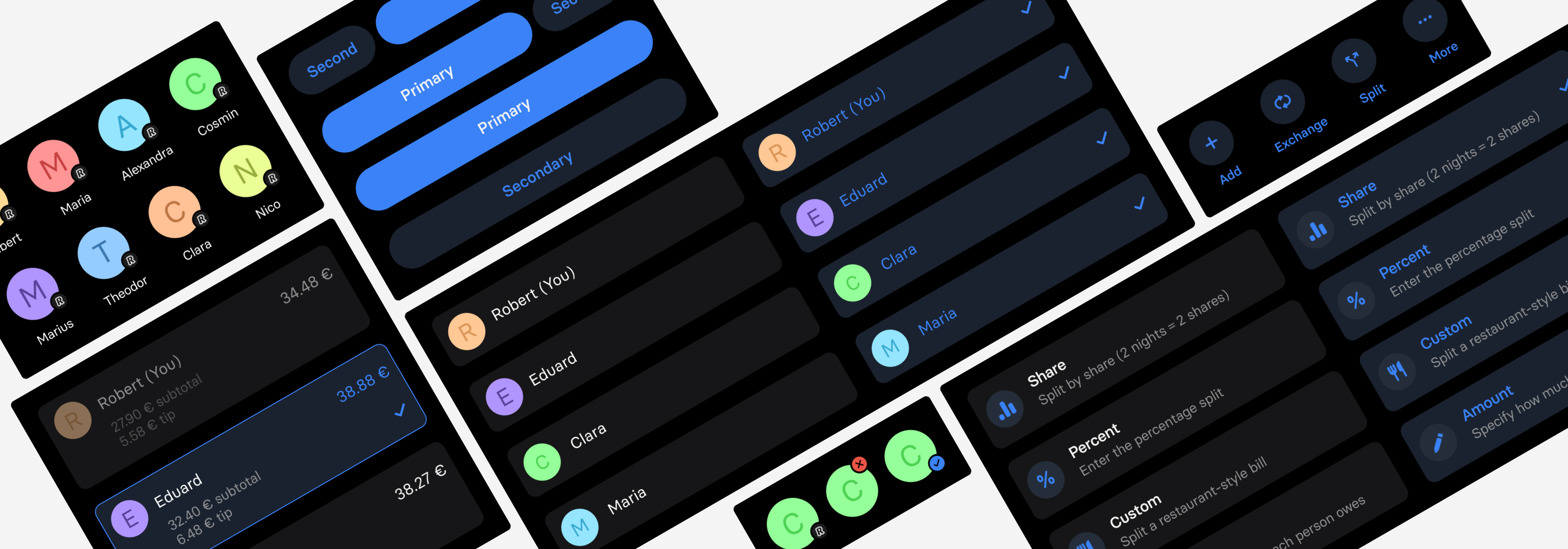
Custom components precisely modeled after Revolut’s existing UI.
Final Product
FINAL DESIGN & PROTOTYPE
Splitting a complicated dinner bill between four people using the feature that I designed.
“I really wish this actually existed. I’d use this a lot.”
“I disliked the idea when you first pitched it to me but surprisingly, I changed my mind after playing around with the prototype”
“You made this feel just like Revolut, which is crazy to me” -my mom
STILL FRAMES
Choosing between the 4 billing types
Adding people to the
Adding a shared item

Bill breakdown (visible calculation)
Calculation specific to one person
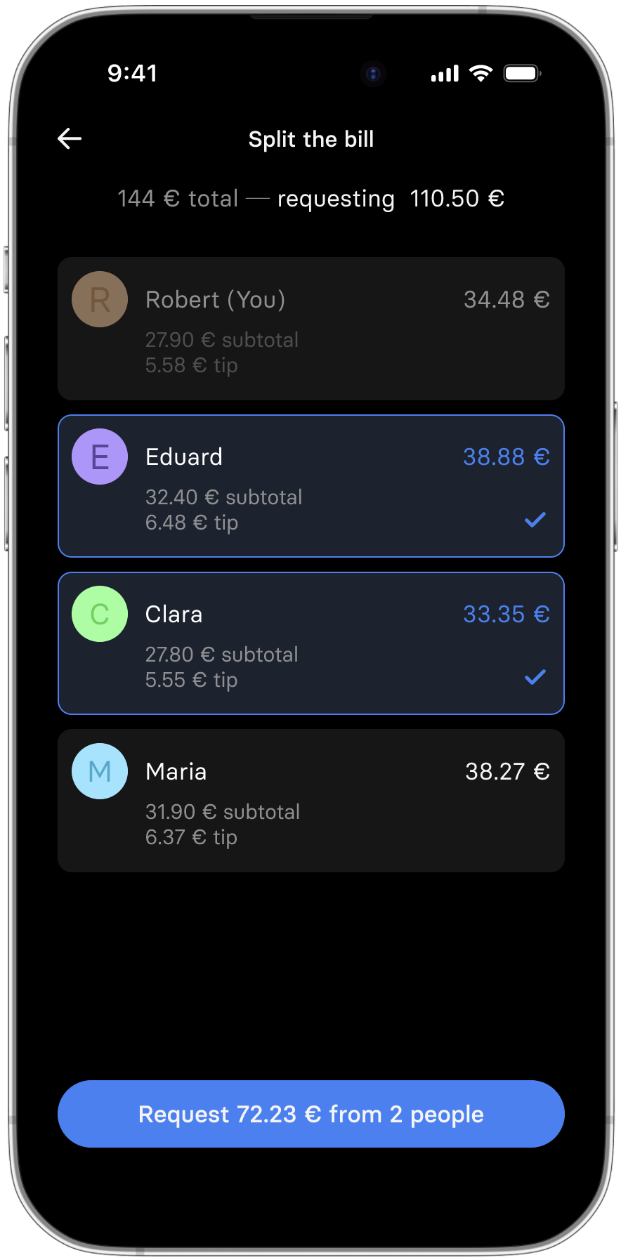
Breakdown of the request confirmation screen
Takeaways
⛈️
Challenges
I faced the most challenges while prototyping & testing the solution — How could I successfully test a solution that could virtually have endless paths that users could take?
☔️
Learnings
How did I deal with this difficult situation? I made the best out of it by conducting (highly) moderated tests and I gathered some valuable feedback.
🌈
Moving Forward
I would conduct more user tests on the first prototype to assess if users would find it more effective upon further usage — could there be a learning curve?
Thank you for reading 🤓
Want to know more about me? Here are some quick ways to do so!

If you want to know anything specific, you can also contact me here